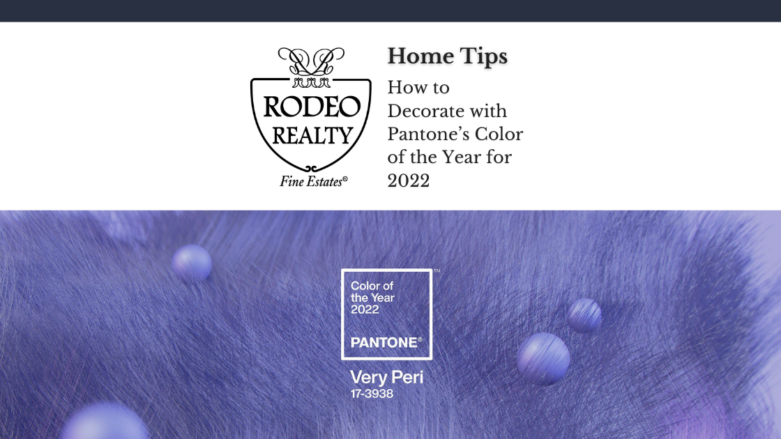
Pantone’s color of the year inspires the development of products and consumer decisions in Southern California. The industries include product packaging, fashion, graphic design, industrial design, and home furnishings. Pantone’s color for 2022 speaks for the transformative moments, as it gives you carefree confidence and daring curiosity.
The vibrant periwinkle blue has violet-red undertones to make you feel decidedly energized and hopeful. The color has an empowering mix of newness to make you dare and emerge from the challenging season. If you consider decorating your home in 2022, Very Peri, a blue-purple hue, is the perfect color.
Here are tips for incorporating Pantone’s color of the year into your home décor and design.
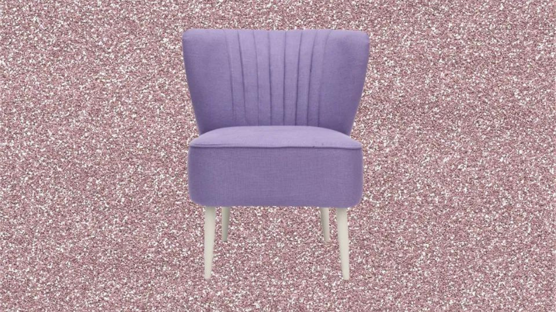
Bring in Statement-making Accents with Pantone’s Color of the year
You can use periwinkle to create a beautiful splash of color in your not-so-bright colored rooms. You can also bring a vibrant hue through some statement-making accent, such as artwork or furnished chairs. The bright purple appearance will bring an eclectic ambiance to your modern dining room.
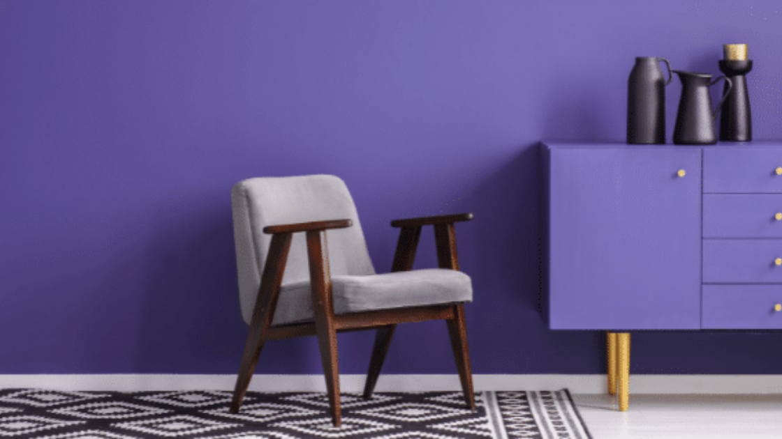
Paint a Light Color on the Walls Pantone’s Color of the year
Very Peri is a vibrant shade; therefore, using it on the entire walls of your large rooms can be devastating. Choose a paint chip inclusive of similar blue-tinted purples to achieve a subtle dose of color. Select the lightest shade as your paint color. Pale periwinkle’s walls will make your dining space beautiful. But you will need to accent them with black trim and accessories to achieve a modern appearance.
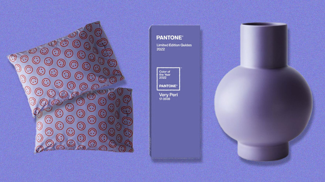
Sprinkle Very Peri in the Purple Decorations
Start by sprinkling the Very Peri, Pantone’s color of the year on a vase of purple flowers. Sprinkle Very Peri on artwork that has a periwinkle palette. You can stay with the shade for a while to observe how it looks. You can make periwinkle your main color stream if you love its appearance.
Paint your Rooms with Shades of Periwinkle
Periwinkle is playful and bright enough to make you feel more energized and alert. You can apply the color in small quantities to cheer up the interiors without feeling too over-the-top. Use the periwinkle shade to paint the walls of a powder room. You can alternatively use it in updating a piece of accent furniture.
Bring Comfort to your Bedroom Pantone’s Color of the year
A warm sprinkle of blue brings feelings of comfort and familiarity to your bedroom, so do periwinkles. You can carry onboard accent periwinkle colored pillows and throw blankets to cozy your bed. Free-flowing drapes made of periwinkle material can be great in creating a stylish air. Periwinkle looks luxurious, particularly on soft and velvety textiles.
Use Periwinkle with the Nature-inspired Shades
Periwinkle matches with colors of nature because it is picked from nature. Try periwinkle, Pantone’s color of the year, on sky blue and light green to attain a soft and serene appearance. Go for deeper shades such as forest green and cobalt if you need a moodier effect. Forest green and cobalt will prevent cobalt green from appearing too sweet.
Getting Started
The season for remodeling your home is here. If you live in Southern California, you can try the Pantone’s color of the year 2022. Go bold with Periwinkle or Very Peri to give your home a stylish yet mood-elevating appearance.