With only a couple weeks left in the first month of the year, there is no better time to ditch some of those 2018 home trends. While certain statement pieces will last through the seasons, the round-up below are so last year! So read below and start off fresh in 2019!!
1. Gallery walls

It’s time to cool it with nailing 20-piece photo collages onto our walls. Instead, make a bigger splash with one large piece that leaves an impression.
“I love family photos, but the stark black or blond wood frames—thank you, Ikea!—that we’ve put up on the wall are a little, well, not trending,” says Los Angeles home designer Kim Gordon.
A wall full of little frames, Gordon says, fails to make a statement and ends up being overlooked and ignored. Plus, those frames will just accumulate dust and fingerprints.
In the new year, Gordon says the tedious clutter will give way to “big, potentially colorful, and absolutely impactful” art that wows—think charcoal sketches or watercolors—“anything to relieve some of the monotony.”
2. Industrial kitchens
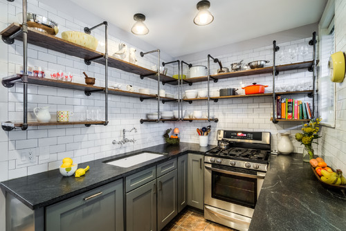
Three years later, and we’re still ringing the closing bell on this exhausted look. It seems old habits (and Edison bulbs) die hard.
So, we’ll say it again for the people in the back: Industrial chic is played out. It’s time to flip the switch on cage lighting and aggressively exposed pipes and beams.
“More often than not, [this look] fails and lacks the authenticity the designer is ardently trying to create,” says David Shove-Brown of Washington, DC–based architecture and design firm //3877.
Industrial kitchens are “not the most inviting place to be the heart of your home—more like living in a Costco,” O’Neill adds. “So, unless you are a professional chef, let’s retire this trend.”
Make the swap for lush, opulent hues in the kitchen—deep (almost black) greens and blues, and dark woodwork—and lean on matte metallics for contrast, recommends Debbie Schamberger of Elite Kitchen & Bath.
“Gold is strong for hardware, faucets, and lighting fixtures—a soft gold, like Champagne,” she says.
3. Boho accessories

We can already hear the boos and hisses on this one, but Portland, OR, designer Justin Riordan isn’t having it.
“Boho has to die,” he says. “It’s totally flippin’ over.”
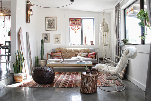
You know what we’re talking about: The macrame wall hangings, the waxy-fake succulents (“You’re not fooling anybody,” Riordan says), and your Moroccan lanterns all had a good run, but it’s time to rein it in.
“You can, of course, continue to buy $19 batik pillows at Target, but stuff like that is just fodder for your next garage sale,” Riordan says. “It comes on really fast and goes away really fast.”
If you just can’t tear yourself away from that gypsy-soul-world-citizen vibe, Riordan suggests channeling those feelings into an authentic piece that reflects a real ethnic tradition—say, a kilim rug—and building the room around that.
4. Word art
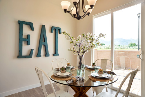
We know—we can’t believe it either, but the word art trend is still happening. In 2019, however, the pros are determined to make it finally stop. Even if you can live, laugh, and love with the best of them, those words don’t belong on your walls.
“Any text art hung in the home meant to be positive just comes across as cheesy and predictable,” says Jessica Boudreaux, an interior designer in Miami and New York City. “Stuart Smalley called, and he wants his signage back.”
Ana Cummings of Ana Interiors agrees: “It’s about as hokey as you can get.”
5. Kitchen islands

But isn’t the island sort of ultimate #kitchengoals? Diana Blaszkiewicz, an associate with TTR Sotheby’s International Realty in Washington, DC, doesn’t think so. Her clients increasingly want to ditch the kitchen island, and she’s happy to oblige.
“They’re bulky and often don’t provide adequate storage space; plus, they’re very easy to bump into in the middle of the night,” she says.
In lieu of an island, situate the dining table closer to the kitchen, Blaszkiewicz recommends, or use modular, moveable storage instead.
6. Gray everything

Will 2019 be the year we do away with gray?
“From walls to napkins, from Florida to Maine, it has been all about gray for so long now, I can hardly remember when it snuck in,” O’Neill laments.
“Because we’ve concentrated on cool grays for so long, it just feels dated at this point,” Riordan adds. “Everything I see in that palette just feels really cold to me.”
Plus, gray has become the go-to neutral for home staging—and that means this hue often “screams ‘newly flipped,’” Blaszkiewicz notes.
That doesn’t mean neutrals are out, but designers are ready for a shift to warmer tones, like sandy taupes.
7. Over-the-stove microwaves
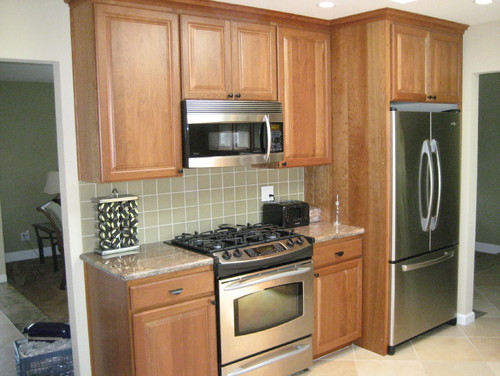
Certain residential features are the brainchildren of home builders—notinterior designers. Such is the story of microwaves situated above cooktops.
“It was never a good design choice,” Cummings says. “Microwaves are so ugly, to put it bluntly.”
The microwave-over-the-range setup is not even functional, says Doug Lewis, a kitchen and bath remodeler in Richmond, VA. The combo’s popularity is driven entirely by the need to economize space—and it sacrifices the ventilation capabilities of a full-size hood vent (as opposed to the scrawny item built into the bottom of over-range microwaves).
“With those, you’re maybe getting 25% venting function,” Lewis says. “Plus, it’s just an awkward height for younger or shorter people to use. Ever tried to reach over your head to get hot soup out of the microwave? Not good.”
So what’s a space-starved homeowner to do? Undercounter microwaves are gaining popularity, Lewis says, and a growing number of cabinet manufacturers offer designs that accommodate them. You can also mount your microwave under upper cabinets while still preserving that precious counter space.
8. Microfiber upholstery
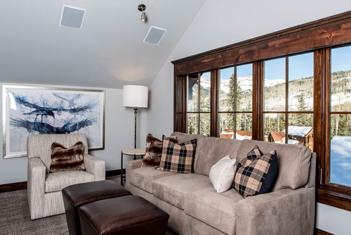
For years now, microfiber has been the hero of home furniture—an affordable and practical choice for its durability. So durable, in fact, that this vaguely suede-like fabric is ready for a rest.
Why? Most microfiber furniture can make the overall design of a room appear dated and cheap, says Beverly Hills, CA–based designer Kita Williams. And while it’s not impossible to find a microfiber piece in a modern shape, aren’t you ready to try something new?
“Err on the side of caution, and stay away from microfiber,” Williams says. “Stick with linen, leather, pleather, tweed, and canvas-type fabrics.”
Courtesy of: Realtor.com
